
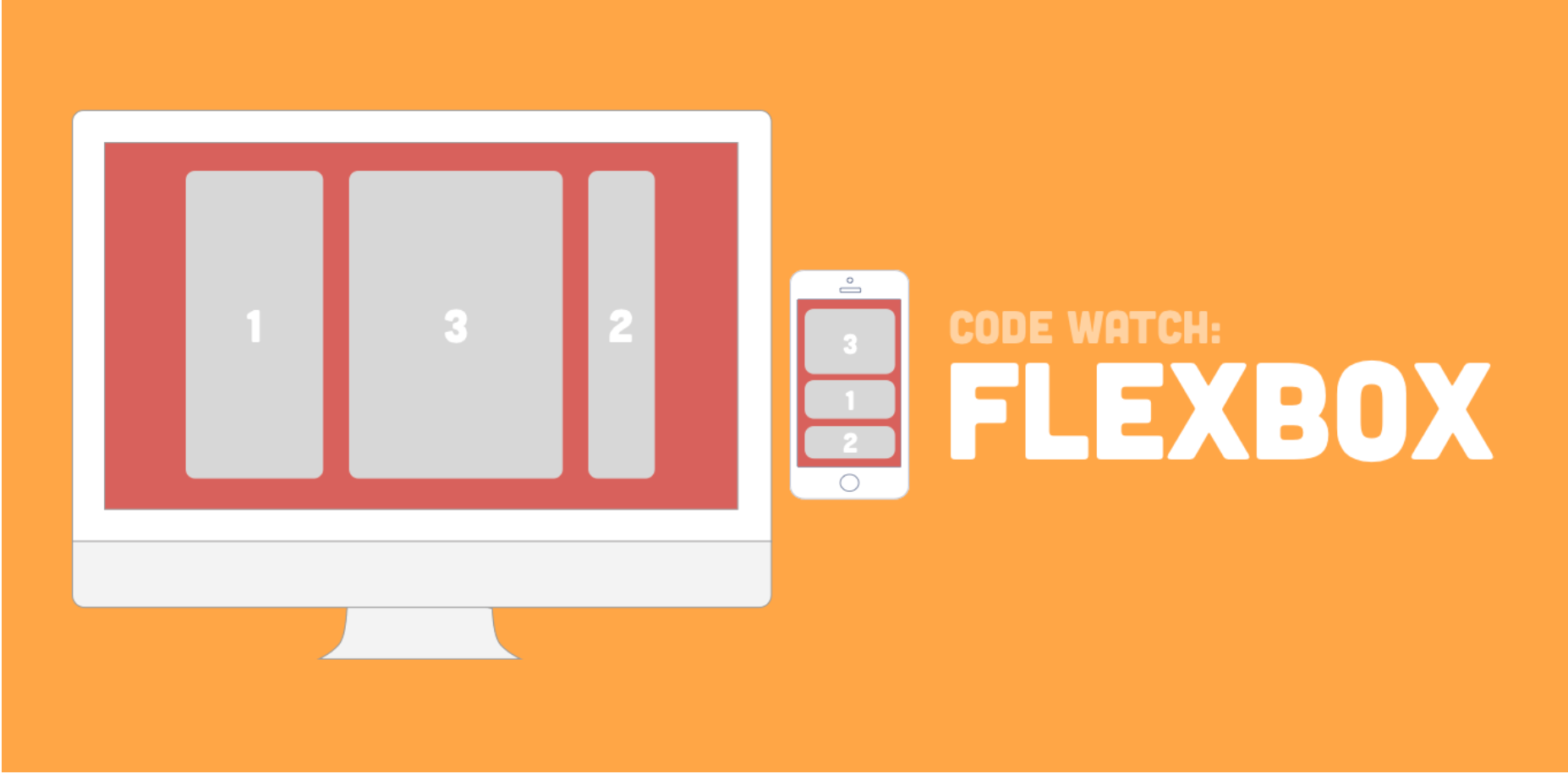
Let’s Build a simple Mock website or Replica of Another website Quickly using Flexbox — sample App NannyFinder App UI
Example — Let’s work on this design Prototype using Flexbox
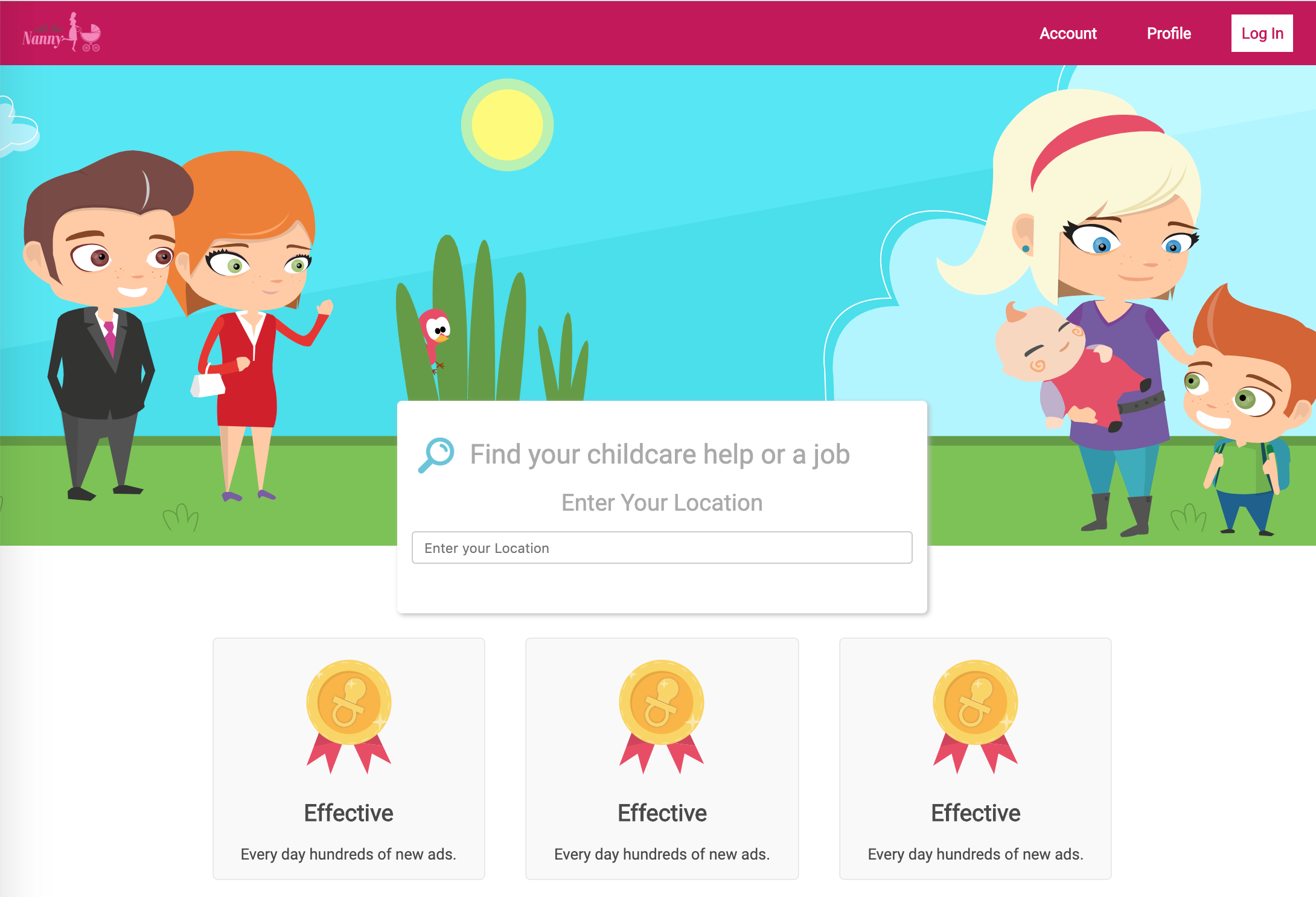
Let’s start with Header
A Complete Guide to Flexbox | CSS-Tricks
Our comprehensive guide to CSS flexbox layout. This complete guide explains everything about flexbox, focusing on all the different possible properties for the parent element (the flex container) and the child elements (the flex items). It also includes history, demos, patterns, and a browser support chart.
Learn how Flexbox works in CSS.
A website's User Interface ("UI") has two components. First, there are the visual elements, such as colors, fonts, and images. Second, there is the placement or positioning of those elements. In Responsive Web Design, a UI layout must accommodate many different browsers and devices accessing the content.

The Flexbox Layout (Flexible Box) module (a W3C Candidate Recommendation as of October 2017) aims at providing a more efficient way to lay out, align and distribute space among items in a container, even when their size is unknown and/or dynamic (thus the word "flex").
The main idea behind the flex layout is to give the container the ability to alter its items’ width/height (and order) to best fill the available space (mostly to accommodate to all kind of display devices and screen sizes). A flex container expands items to fill available free space, or shrinks them to prevent overflow.
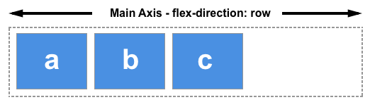
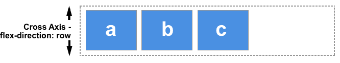
The two axes of the flexbox Section
When working with flexbox you need to think in terms of two axes — the main axis and the cross axis. The main axis is defined by the [flex-direction](https://developer.mozilla.org/en-US/docs/Web/CSS/flex-direction) property, and the cross axis runs perpendicular to it. Everything we do with flexbox refers back to these axes, so it is worth understanding how they work from the outset.
The main axis Section (Golden Rules )
The main axis is defined by flex-direction, which has four possible values:
-
row -
row-reverse -
column -
column-reverse
Should you choose row or row-reverse, your main axis will run along the row in the inline direction.
Choose column or column-reverse and your main axis will run from the top of the page to the bottom — in the block direction.
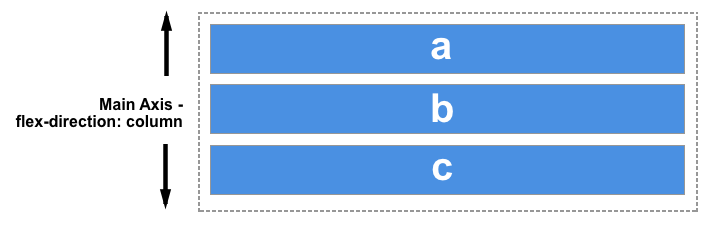
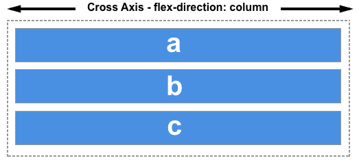
The cross axis Section
The cross axis runs perpendicular to the main axis, therefore if your flex-direction (main axis) is set to row or row-reverse the cross axis runs down the columns.
If your main axis is column or column-reverse then the cross axis runs along the rows.
Understanding which axis is which is important when we start to look at aligning and justifying flex items; flexbox features properties that align and justify-content along one axis or the other.
Next, these are two different containers where we can use flex on both containers, once the container is divided with 33% each and second container is divided with 50% each, flex-direction is row only and we can have justify content as space-between
Read More about flexbox here
Aligning Items in a Flex Container
One of the reasons that flexbox quickly caught the interest of web developers is that it brought proper alignment capabilities to the web for the first time. It enabled proper vertical alignment, so we can at last easily center a box.
Comments