CSS Layout: Evolution Detailed by Example
There are many ways to do same things in CSS, its just evolution which tool place to decicde which approach is better, These are some most common ways of building CSS Layouts, Currently we mostly use css grid or Flex to make resposnsive layouts but it was long journey from table layout to flex layout.
We will talk about these one by one
-
html table
-
display: table
-
float
-
absolution positioning
-
inline-block
-
bootstrap grid system
-
flexbox
-
grid
Display in CSS
p.ex1 {display: none;}
p.ex2 {display: inline;}
p.ex3 {display: block;}
p.ex4 {display: inline-block;}
The display property specifies the display behavior (the type of rendering box) of an element.
In HTML, the default display property value is taken from the HTML specifications or from the browser/user default style sheet. The default value in XML is inline, including SVG elements.
Table for Display Property
| Value | Description |
|---|---|
| inline | Displays an element as an inline element (like ). Any height and width properties will have no effect |
| block | Displays an element as a block element (like ). It starts on a new line, and takes up the whole width |
| contents | Makes the container disappear, making the child elements children of the element the next level up in the DOM |
| flex | Displays an element as a block-level flex container |
| grid | Displays an element as a block-level grid container |
| inline-block | Displays an element as an inline-level block container. The element itself is formatted as an inline element, but you can apply height and width values |
| inline-flex | Displays an element as an inline-level flex container |
| inline-grid | Displays an element as an inline-level grid container |
| inline-table | The element is displayed as an inline-level table |
| list-item | Let the element behave like a |
| run-in | Displays an element as either block or inline, depending on context |
| table | Let the element behave like a table element |
HTML Table
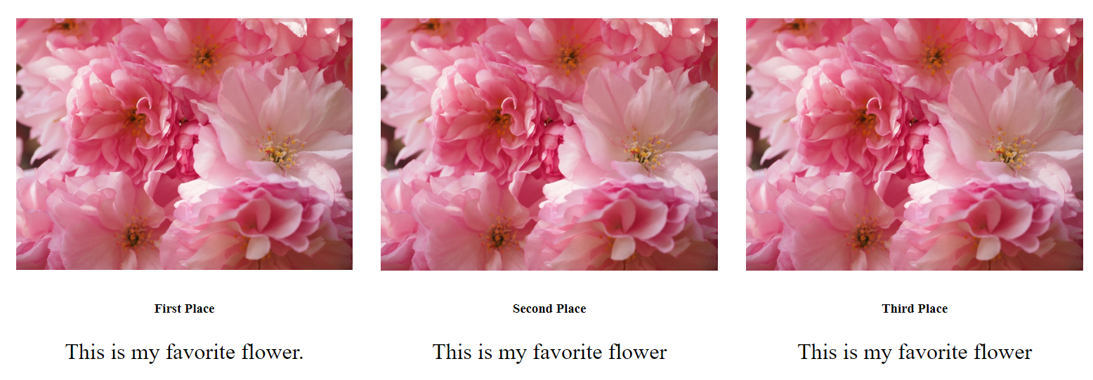
The HTML provides a an table element with two rows, one for the images and one for the text. Tables were a natural first choice in early web development as the model for any layout is Cartesian in nature: we think of an area of two dimensional space in terms of rows and columns.
    <table class="flowers">
       <tr>
           <td>
              <img class="pix" src="images/cherry_blossom.jpg" alt="cherries"> </td>
           <td>
              <img class="pix" src="images/cherry_blossom.jpg" alt="cherries"> </td>
           <td>
              <img class="pix" src="images/cherry_blossom.jpg" alt="cherries"> </td>
        </tr>
        <tr>
            <td>
               <h3>First Place</h3>
               <p class="comment">This is my favorite flower.</p>
             </td>
             <td>
                <h3>Second Place</h3>
                <p class="comment">This is my favorite flower</p>
             </td>
             <td>
                 <h3>Third Place</h3>
                 <p class="comment">This is my favorite flower</p>
             </td>
         </tr>
    </table>
The .flowers table is rendered with border-collapse so that there is a single border between cells. The default (border-separate) places two borders between cells and this can cause styling problems and the extra “space” created by two borders is especially undesirable for layout calculations. The **pix **class applies a width of 100% to the image tag which causes the otherwise large image (1200 x 900 px) to fit within the table.
The page is not responsive. If you shrink the screen or render it on device with a smaller viewport, the table goes into overflow and you can’t see it.
Semantic HTML tells us that this is not the appropriate element to use for a layout. Tables are supposed to display tabular information, like data. Screen readers rely on the semantics of the HTML to inform their users of content and this placing this code on a page would confuse a screen reader.
    .flowers {
        table-layout: fixed;
        border-collapse: collapse;
    }
    td {
        padding: 20px 20px 0 20px;
    }
    .pix {
        width: 100%;
    }
    h3 {
        text-align: center;
    }
    .comment {
        padding: 0 30px;
        font-size: 2rem;
        text-align: center;
    }
CSS display: table
The display: table allows the developer to make a table out of block elements. It essentially places the data in the block elements that are classed with the names “row” and “cell” as if they were in an HTML table element where
    <section class="container">
        <div class="row">
            <div class="cell">
                <img src="images/cherry_blossom.jpg" alt="cherries">
            </div>
            <div class="cell">
                <img src="images/cherry_blossom.jpg" alt="cherries">
            </div>
            <div class="cell">
                <img src="images/cherry_blossom.jpg" alt="cherries">
            </div>
        </div>
        <div class="row">
            <div class="cell">
                <h3>My Favorite Photo</h3>
            </div>
            <div class="cell">
                <h3>My Favorite Photo</h3>
            </div>
            <div class="cell">
                <h3>My Favorite Photo</h3>
            </div>
        </div>
    </section>
The CSS for this example assigns the names “row” and “cell” to the div tags that contain the image and the text. The image width is again set to 100% so that the large images fits within the table. The display property allows for the values “table”, “table-row”, and “table-cell”. These property values cause the table to be rendered in a tabular form. Text is aligned using text-align:center as in the HTML table.
This layout looks very much like the HTML table layout above, but it has the advantage of being responsive. It is responsive in that the content fits in the viewport, but only by shrinking it.
    .container {
         display: table;
    }

    .row {
         display: table-row;
    }

    .cell {
         display: table-cell;
         padding: 20px;
         text-align: center;
    }
    .cell img {
         width: 100%;
    }
CSS float and clear
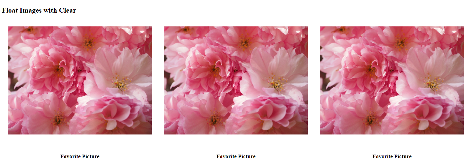
The HTML for float uses block elements classed with the familiar “row” and “column” class names to indicate that the content should be laid out in a basically tabular format.
    <div class="row">
        <div class="column">
            <img src="images/cherry_blossom.jpg" alt="cherries">
            </div>
            <div class="column">
                <img src="images/cherry_blossom.jpg" alt="cherries">
            </div>
            <div class="column">
                <img src="images/cherry_blossom.jpg" alt="cherries">
            </div>
        </div>
    <div class="row">
        <div class="column text">
            <h3>Favorite Picture</h3>
        </div>
        <div class="column text">
            <h3>Favorite Picture</h3>
        </div>
        <div class="column text">
            <h3>Favorite Picture</h3>
        </div>
    </div>
The CSS float property was originally used to float text around images. Floating a block element or an image, which is inline-block, will affect the positions of elements around it as it disrupts the flow of the page. Picture a fish tank with the fish toys not anchored to anything and just floating around inside. With the clear property, it is possible to terminate the float and return to the normal flow of the page. These properties were used to create very complex layouts that go behind the row/column model used in the examples here. However, once again the nature of the problem here, lends itself to thinking in terms of row and column.
Note that if you place the float on the body of the page, you don’t have to clear it. Clearing floats became a point of discussion, and the technique shown here using the pseudo selector ::after and placing empty content with a clear property is just one technique known as “clearfix”.
The width of the column is set with a percentage value and this makes the page responsive. It’s not as sophisticated a responsiveness as you could get with media queries, but the content doesn’t overflow, it just shrinks.
    * {
        box-sizing: border-box;
    }
    .column {
        float: left;
        width: 33.33%;
        padding: 20px;
    }
    .column img{
        width: 100%;
    }
    .row::after {
        content: "";
        clear: both;
    }
    .text {
        text-align: center;
    }
CSS position: absolute
The HTML structure for absolute positioning creates a container with 3 vertical structures equally spaced from one other classed as “one”, “two”, and “three”. There is no indication of a table model in either the structure or style. I’ve included content before and after the .flower-container and this is to help explain why height is set on the .flower-container.
    <h4>Flow before the container</h4>
    <div class="flower-container">
        <div class="one">
            <img src="images/cherry_blossom.jpg" alt="Cherries">
            <p>This is my favorite.</p>
        </div>
        <div class="two">
            <img src="images/cherry_blossom.jpg" alt="Cherries">
            <p>This is my favorite.</p>
        </div>
        <div class="three">
            <img src="images/cherry_blossom.jpg" alt="Cherries">
            <p>This is my favorite.</p>
        </div>
    </div>
    <p>Flow after the container</p>
This layout implements one of the “tricks” of CSS positioning, namely wrapping an absolutely valued container within a relatively valued container. When this makes sense to you, you will have mastered your understanding of static, relative, absolute and fixed display properties. Static positioning is just the normal right to left, top to bottom flow that you might think of as the default flow. The difference between absolute and fixed positioning is that absolute places content relative to it’s parent, while fixed places content relative to the window. Relatively positioned items can flow after previous content or be positioned relative to their container. Basically display:relative provides a non-static parent for the display:absolute to render in. By placing absolutely positioned items within a relative container, the positions you specify for these items are relative to the position of the container and not the window. It is important when using this technique to set a height on the relatively positioned item if you want content to flow after it.
All of the divs placed in the .flower-container are positioned absolute with top at the middle (50%) and the transformed up and to the left (-50%, -50%). The width (20%) will give the distance between the items in what looks like a margin, and then padding (20px) just pulls them away from a box-shadowed edge. The effect of this is to look like a Polaroid photo. Each of the 3 photo items is assigned its own left position (25%, 50%, 75%) in order to be placed in consecutive horizontal position.
With the use of percentage within the absolute positioning, this layout is responsive in that it shrinks rather than overflows at difference viewport sizes.
    .flower-container {
        position: relative;
        height: 300px;
    }
    .flower-container div {
         position: absolute;
         top: 50%;
         transform: translate(-50%, -50%);
         width: 20%;
         padding: 20px;
         text-align: center;
         box-shadow: 0 0 30px rgba(0, 0, 0, 0.2);
    }
    .flower-container .one {
         left: 25%;
    }
    div.two {
         left: 50%;
    }
    div.three {
         left: 75%;
    }
    .flower-container img {
         width: 100%;
    }
CSS display:inline-block
The HTML for the the inline-block layout is similar to the display:absolute in that there is a container with 3 vertical structures. Sometimes there is a question why use a block element with an inline-block style rather than an inline element — or why not use a span instead of a div. The answer is usually that you want to be able to provide block element styles such as height. In this case we’re just taking advantage of the fact that inline-block and be used to horizontally align containers that, because of the items they too contain, may be block level items.
    <div class="container">
        <div class="pic">
            <img src="images/cherry_blossom.jpg">
            <h3>This is my favorite picture</h3>
        </div>
        <div class="pic">
            <img src="images/cherry_blossom.jpg">
            <h3>This is my favorite picture</h3>
        </div>
        <div class="pic">
            <img src="images/cherry_blossom.jpg">
            <h3>This is my favorite picture</h3>
        </div>
    </div>
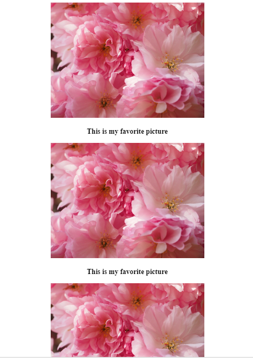
The set of 3 photos are contained in .container are styled with inline-block to arrange them horizontally. Additionally we want them centered vertically. When working with block elements, you might use margin: auto to center, but because these are inline-block, the text-align: center is the choice that does the job. The width of the images is set using rem which provides a size relative to the size of the the root element. The choice of the value 25 for the width is a subjective based on knowing that the inline-block elements will wrap and that the centering can provide right and left margins. The fact that there is wrapping and size is a relative amount makes this technique responsive in a way that previous layouts were not.
    .container {
        text-align: center;
    }
    .pic {
        display: inline-block;
    }
    .pic img {
        width: 25rem;
    }
 Wrapping with smaller view port
CSS Bootstrap Grid System
In order to use the Bootstrap Grid System and the thumbnail component that I’m using for this demo, you need to install jquery, Bootstrap…js and Bootstrap…css.
<link rel="stylesheet" href="https://cdnjs.cloudflare.com/ajax/libs/twitter-boots<script src="https://cdnjs.cloudflare.com/ajax/libs/jquery/3.3.1/jquery.js" async defer></script>

<script src="https://cdnjs.cloudflare.com/ajax/libs/twitter-bootstrap/4.1.1/js/bootstrap.js" async defer>
</script>
  <script src="https://cdnjs.cloudflare.com/ajax/libs/twitter-bootstrap/4.1.1/js/bootstrap.js" async defer></script>
Bootstrap provides a row, column model for laying out elements. The columns include viewport sizes (like -md-) at which wrapping will occur and values which must add up to 12 (like -4-) before wrapping occurs. The HTML below encodes the Bootstrap **thumbnail **which is an interactive component that allows the user to click on the photo to see a larger image in a new tab. This accounts for the extra code. Essentially, the structure is similar to the display:table example above.
<div class="container">
<h2>Image Gallery</h2>
<div class="row">
<div class="col-md-4">
<div class="thumbnail pic">
<a class="pic" href="images/cherry_blossom.jpg" alt="Cherries" target="_blank">
<img class="pic" src="images/cherry_blossom.jpg" alt="Cherries">
</a>
<div class="caption">
<h3>Favorite Photo </h3>
<p>Lorem ipsum donec id elit non mi porta gravida at eget metus.</p>
</div>
</div>
</div>
<div class="col-md-4">
<div class="thumbnail">
<a class="pic" href="images/cherry_blossom.jpg" alt="Cherries" target="_blank">
<img class="pic" src="images/cherry_blossom.jpg" alt="Cherries">
</a>
<div class="caption">
<h3>Favorite Photo </h3>
<p>Lorem ipsum donec id elit non mi porta gravida at eget metus.</p>
</div>
</div>
</div>
</div>
</div>Because we are using Bootstrap CSS classes, the CSS that is provided just forces our large photo to fit in its Bootstrap configured container. Bootstrap provides for full responsiveness with media queries.
    .pic {
        width: 100%;
    }
CSS display:flexbox
Flex box provides either horizontal or vertical layout with the justify property to help with alignment on the layout axis and the align property to help with alignment on the non-layout property. Sometimes developers will use CSS class names like row and column, but in general the model is not tabular. The idea is that you will let your elements flow in one direction (horizontal) or the other (vertical) with horizontal being the default.
The HTML suggests two containers that each contain lists of items.
    <ul class="flex-container">
        <li class="flex-item">
           <img src="images/cherry_blossom.jpg">
           <h3 class="description">My Favorite flower.</h3>
        </li>
        <li class="flex-item">
            <img src="images/cherry_blossom.jpg">
            <h3 class="description">My Favorite flower.</h3>
        </li>
        <li class="flex-item">
            <img src="images/cherry_blossom.jpg">
            <h3 class="description">My Favorite flower.</h3>
        </li>
    </ul>
The CSS for this layout relies on the default horizontal flex direction. For the horizontal axis, the **justify **property is set to space-around to “spread” the images out across the page but use any extra space for free space around the images. For the vertical axis, the **align-content **property with a value of flex-start is used to put any extra space at the end of the column. The idea is to make this layout responsive by just causing the flexed contains to stack on top of one another when there’s not enough room to place side by side.
The
- tag adds padding by default and so is set to 0 when using it for a layout container here.
The 1200x900 px image’s height must be set as there is nothing to constrain it whereas the width is constrained by the horizontal alignment.
This layout is responsive and wraps — images stack vertically — when viewed in smaller viewports.
    ul.flex-container {
        list-style-type: none;
        display: flex;
        justify-content: space-around;
        flex-wrap: wrap;
        align-content: flex-start;
    }
    ul.flex-container {
        padding: 0;
    }
    ul.flex-container img {
        height: 300px;
    }
    .description {
        text-align: center;
    }
CSD display:grid
The HTML structure for the CSS grid layout provides no hint that the structure will appear as a row/column table like visual. If you’re a programmer who has worked with vector or array structures in which rows and columns can be specified as options, this will be a familiar way of dealing with data. In fact the grid layout makes is easy to change the layout with media queries.
For this application of the horizontal alignment of 3 photos followed by the horizontal alignment of text, we just provide a structure that is a container with items.
The grid is the next step after from flexbox in CSS evolution. Where flexbox focuses on a single dimension or axis, grid is a 2-dimensional display property. Grid is only newly implemented in browsers and so depending on your environment, it may not be usable yet. See “can I use” for up to date information on this.
    <div class="grid-container">
        <div class="grid-item">
            <img src="images/cherry_blossom.jpg" alt="Cherries">
            <h3>My Favorite Picture</h3>
        </div>
        <div class="grid-item">
            <img src="images/cherry_blossom.jpg" alt="Cherries">
            <h3>My Favorite Picture</h3>
        </div>
        <div class="grid-item">
            <img src="images/cherry_blossom.jpg" alt="Cherries">
            <h3>My Favorite Picture</h3>
        </div>
    </div>
The CSS for the grid layout tells the browser to use display:grid and then with the grid-template-columns property lays out the 3 columns with the “auto” property. The media query provides a way to wrap the elements when the viewport shrinks.
This is a responsive layout.
    .grid-container {
        display: grid;
        grid-column-gap: 10px;
        grid-row-gap: 10px;
        grid-template-columns: auto auto auto;
    }

    [@media](http://twitter.com/media) screen and (max-width: 992px) {
        .grid-container {
            grid-template-columns: repeat(auto-fill, minmax(300px, 1fr))
        }
    }
    .grid-item {
        padding: 20px;
        font-size: 30px;
        text-align: center;
    }
     .grid-item img {
        width: 100%;
     }
Compare and Choose a Layout Technique
As I’ve pointed out in describing each of the techniques, there is a common model upon which most of side by side layout is based: the table. This makes sense because historically, HTML only provided one 2 dimensional element namely
Comments